The rise of bold and bright colours has been particularly prevalent in contemporary art in 2023. Pantone named their legendary Colour of the Year to be Viva Magenta, a magnificent and vibrating hue of red, signalling the art world’s strong turn towards the bold and bright. Pantone’s nuanced approach to pink encourages strength, courage, and self-expression; in a world still recovering from the global pandemic and the political turmoil that came with it, such a strong and resonant colour inspires optimism and joy. Exuberant and electrifying shades of red, pink, and magenta that similarly resonate can be found across the colourful works of these 5 artists:
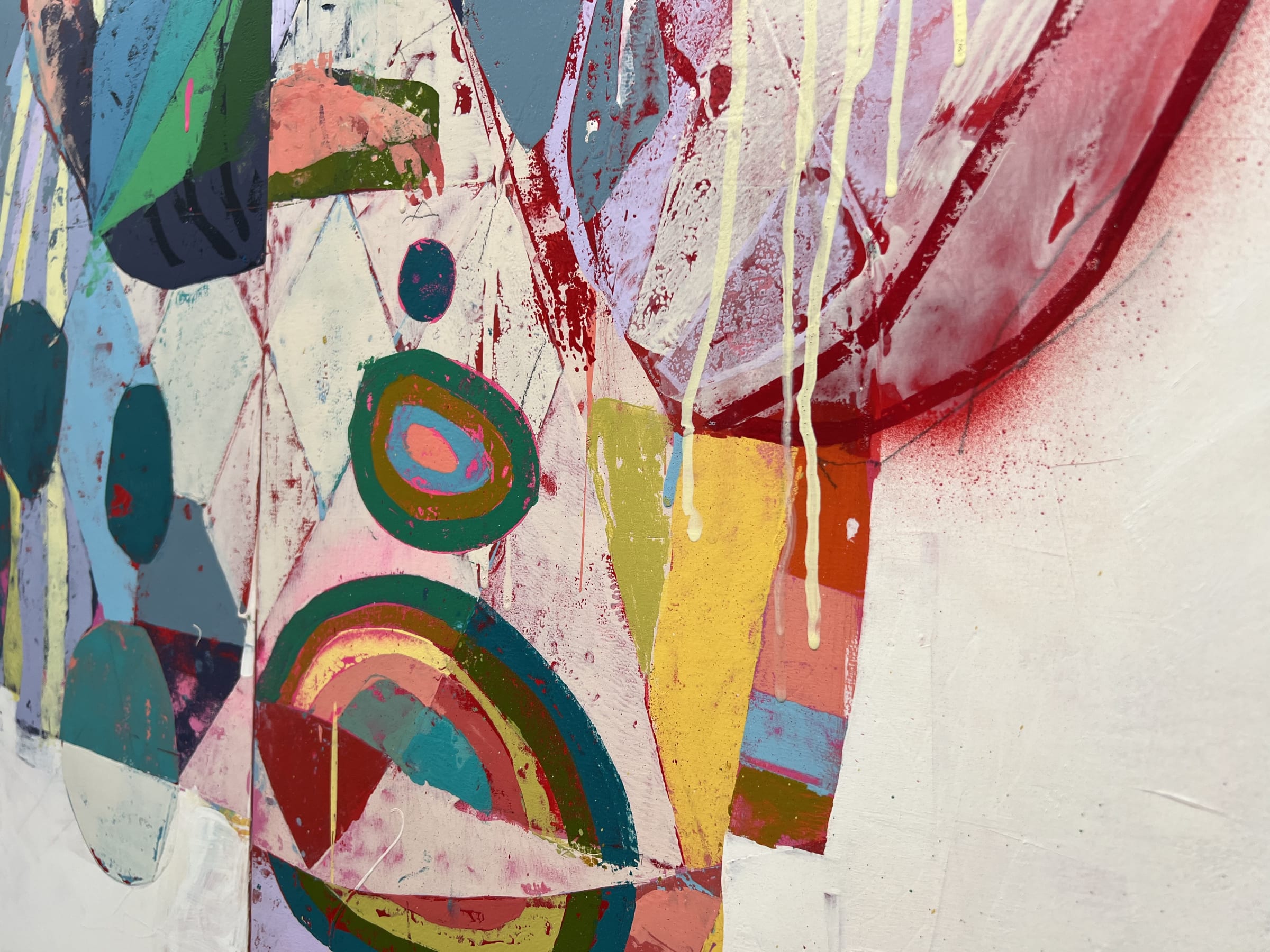
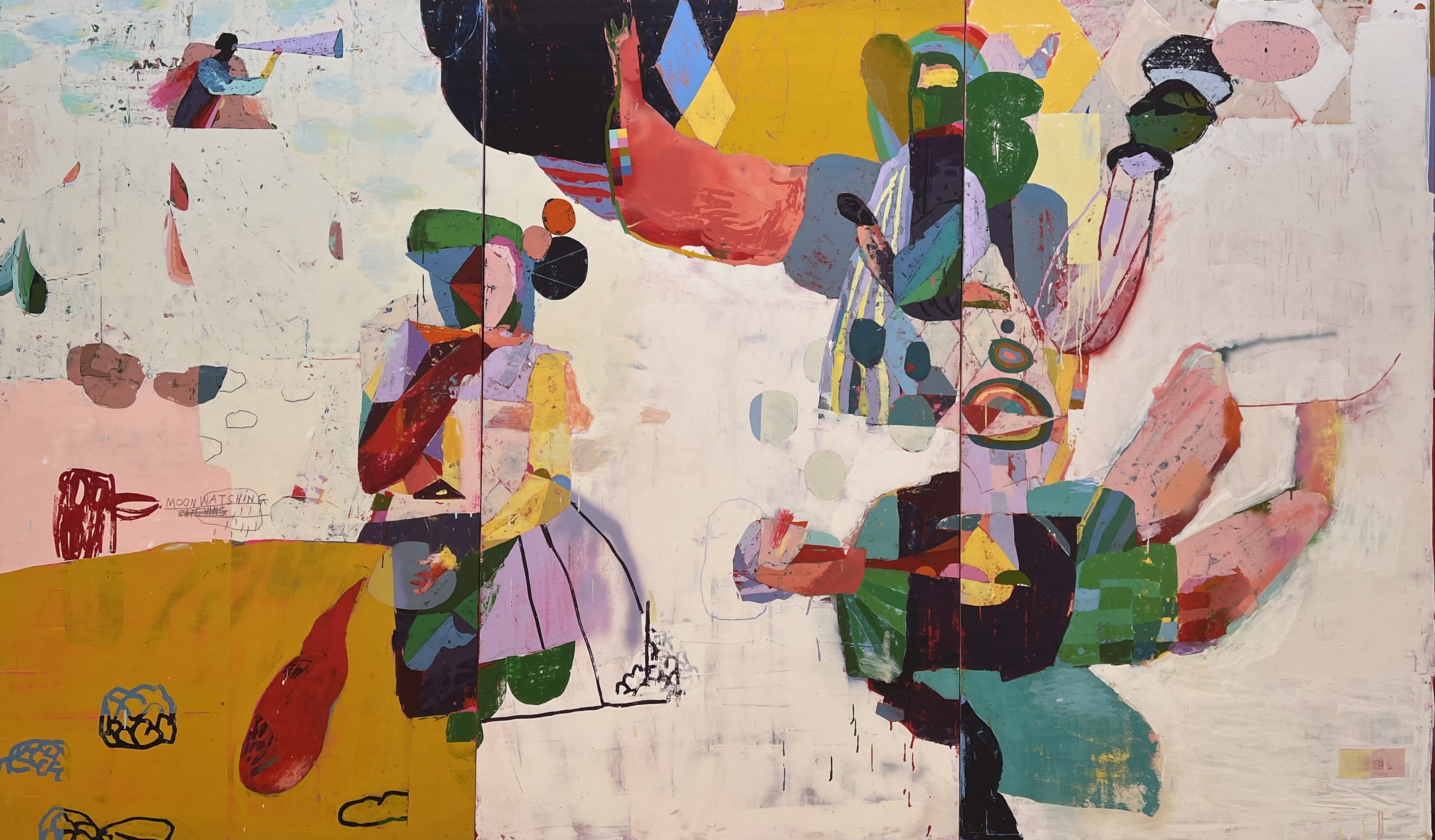
Danny Gretscher’s large-scale paintings playfully engage with vivid colour, with snatches of deep magenta appearing across his whimsical scenes. Gretscher is a German contemporary painter based in Berlin, known for his recognisable style of semi-abstract symbolism combined with use of bold and unexpected colour. Operating between figuration and abstraction, Gretscher creates ethereal figures by building up layers of pigment and tone – bright greens, deep purples, turmeric yellows – situated on softer backgrounds of pinks and creams. His creative practise is dynamic: his pieces are full depth and texture from painting and repainting, scraping and scribbling, drawing and writing. The playful use of vivid colour and pattern evokes childhood and whimsy, making the pieces feel nostalgic and dreamlike – his recent paintings can be viewed here. Gretscher’s highly anticipated solo show at Rhodes Contemporary Gallery recently opened: ‘When it’s in the middle of the day, and the moon is shining.’ More information on this exhibition can be found here.
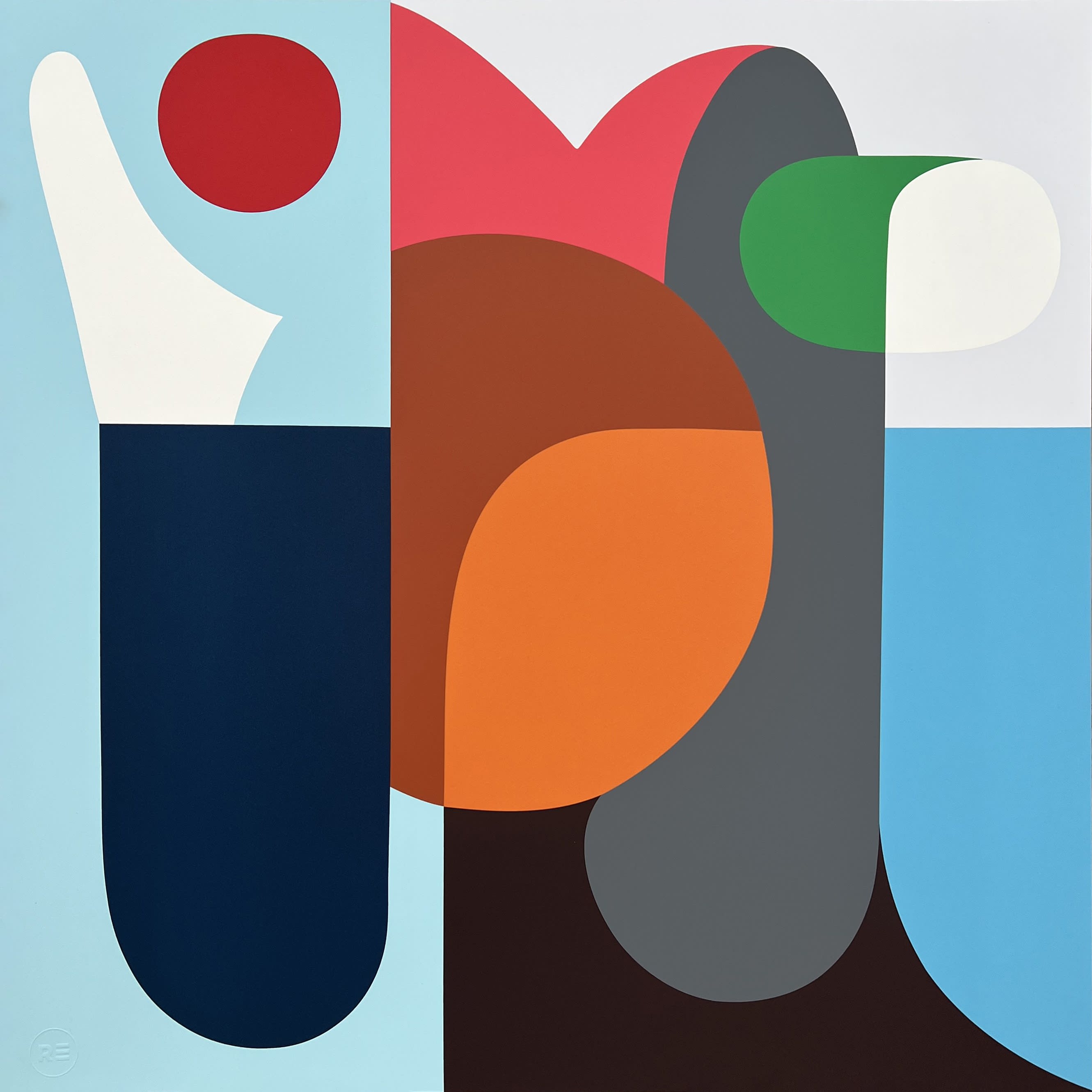
Stephen Ormandy’s works also bring in hues of brilliant magenta, playing into this year’s trend of bold and bright colour trends in art. Ormandy is an Australian artist whose works combine geometric and lyrical forms. Using planes of flat pigment, Ormandy’s works contrast bold colour planes against one another, using simplicity of shape and hue to build evocative and eye-catching pieces that are inspired by the natural world. His print ‘Harbour’ (2023) was recently released with much anticipation in conjunction with Woolwich Contemporary Print Fair. ‘Harbour,’ a limited edition of just 35, evokes a maritime setting with its calming blues – yet the warm pinks and oranges catch the eye, drawing the viewer in. This print is now available to purchase here at Rhodes Editions, or check our more of his pieces here.

The creations dreamt up by Jan Kalab are glowing and almost hypnotic. Czech visual artist Kalab pioneered graffiti in the Czech Republic in the 1990s. His practise today still pushes boundaries of creation in unexpected ways, seen in his dynamic acrylic works, which can be viewed here at Rhodes Contemporary Art Gallery. Working with electric colour and organic form, Jan’s unique style is expressed in his most recent print ‘Glow Explosion’ (2023). This limited edition of 50 draws the viewer in through its hypnotic use of colour: centred in a halo of electric blue and vibrating magenta is a fiery yellow centre, tying in perfectly to the bright and bold trend. The colour pulsates, breathing life and energy into this print. More works by Jan Kalab can be found here at Rhodes Editions.
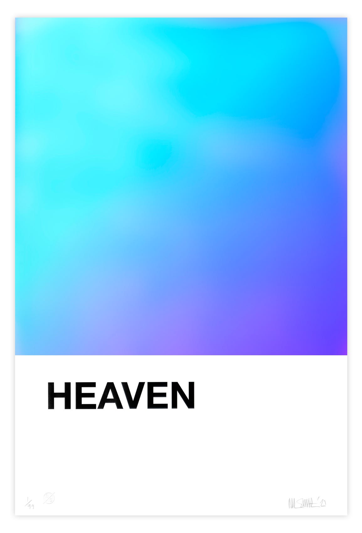
Nick Smith’s colour swatch artworks cheekily take inspiration from Pantone’s visual style. A contemporary artist based in Scotland, Smith is known for his recognisable pixelated style. His large-scale colour swatch series take particular inspiration from Pantone, mimicking the intersection of pigment and language. His limited edition ‘HEAVEN’ plays into the bright and bold colour trend: created through a collaboration between Nick Smith and Foilco, the piece uses a swatch of resplendent film. This foil glows in ultra-metallic tones of blue, purple and magenta as it refracts and reflects light, aptly named ‘HEAVEN’ for its dreamlike and ethereal vibe. Prints from Nick Smith can be found here at Rhodes Editions.
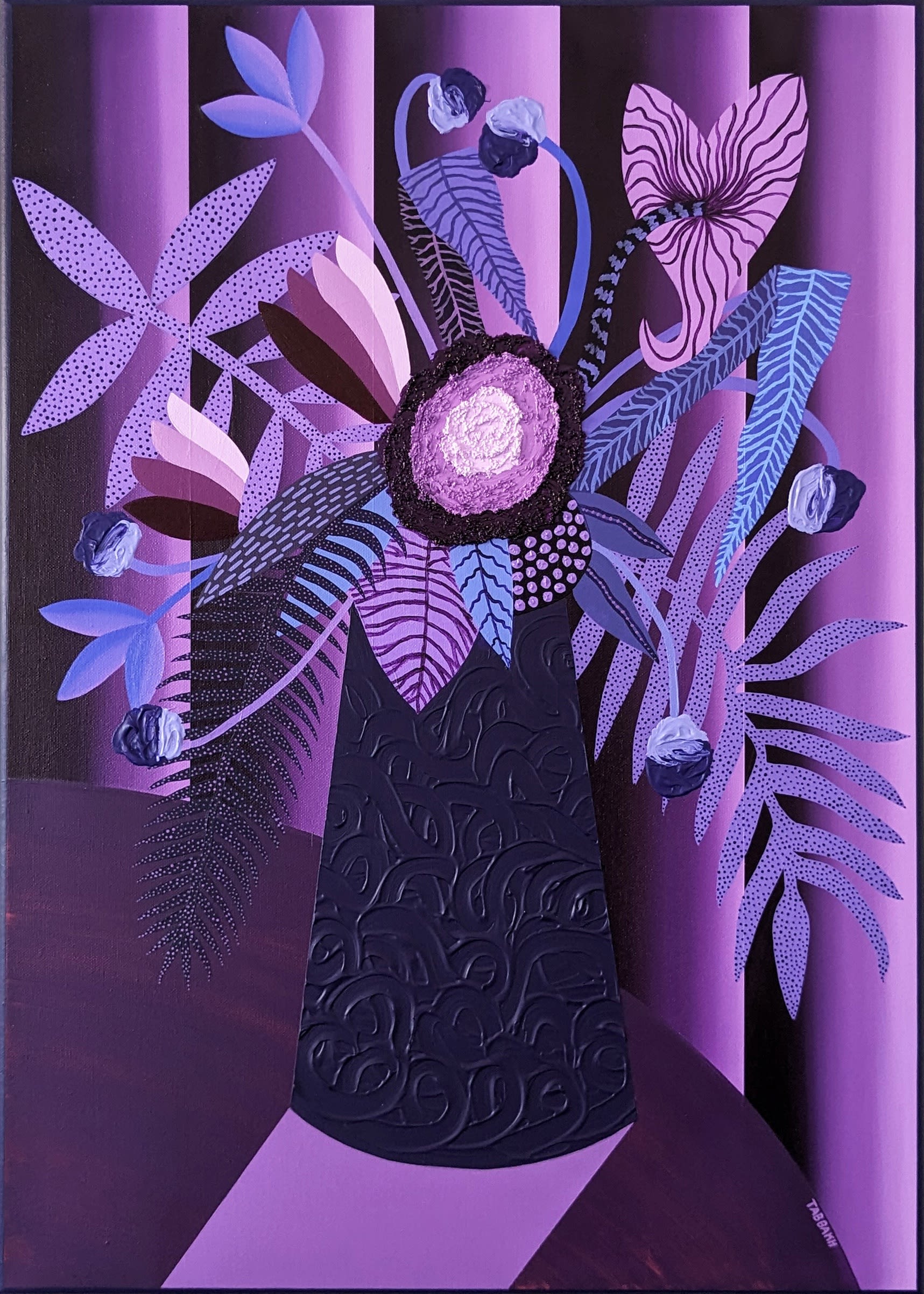
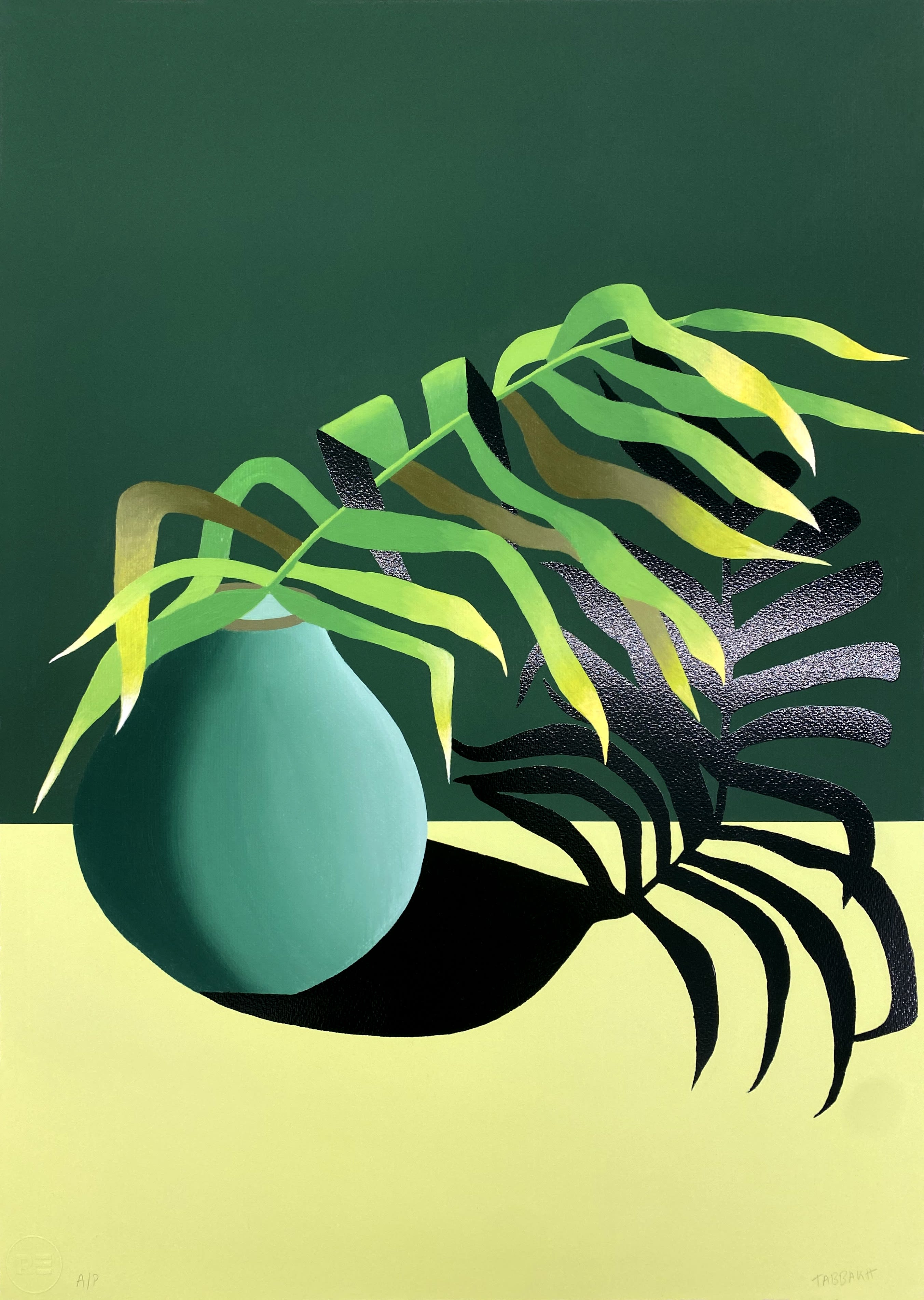
The paintings of Cathy Tabbakh enlighten interior scenes with vibrant colour in a modern and contemporary take on the still life genre. A French contemporary artist, Tabbakh employs architectural and botanical motifs in her work, creating joyful, colourful, and welcoming scenes that feel almost surreal at times. She focuses on the juxtaposition of light and shadow, imbuing her compositions with vivid overlaying colour – in some pieces, this feels like the cool blue light of twilight, in others, the fiery warmth of golden hour. Her paintings are calm and contemplative, often looking towards the subtleties of everyday life and objects as inspiration; yet her use of expansive and exuberant colour is unafraid and unapologetic. Find her work here at Rhodes Contemporary Gallery, or her first limited print - 'Dont Envy Green' - with Rhodes Editions here.
For information on any of these artists or works please email info@rhodescontemporaryart.com .